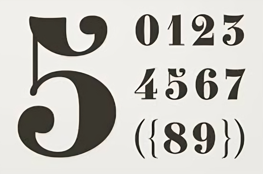
In the world of typography, the typeface you choose can significantly influence the readability and aesthetic of your project. When it comes to number fonts, selecting the right style is crucial for conveying information clearly and effectively. This article delves into the importance of number fonts, explores various types, and provides tips on how to choose the best ones for your design needs.
Why Number Fonts Matter
Numbers are everywhere—on invoices, digital interfaces, advertisements, and more. The font used for numbers can affect:
- Readability: Clear, legible numbers help prevent miscommunication, especially in critical contexts like finance and data presentation.
- Aesthetic Appeal: The right number font can enhance the overall design and branding of a project.
- Emphasis: Certain fonts can make numbers stand out, drawing attention to key data points.
With these factors in mind, it’s essential to consider your options when selecting a number font.
Types of Number Fonts
1. Serif Fonts
Serif fonts, characterized by their decorative strokes at the ends of letters, can bring a classic and sophisticated touch to your designs. Common serif number fonts include:
- Times New Roman: A staple in print and digital media, this font is known for its readability and formality.
- Georgia: Designed for clarity on screens, Georgia features larger counters and wider letter spacing, making numbers easily distinguishable.
When to Use Serif Fonts
Serif number fonts work well in formal documents, academic publications, and any project that requires a touch of elegance.
2. Sans Serif Fonts
Sans serif fonts lack the decorative strokes found in serif fonts, giving them a clean and modern look. Popular sans serif number fonts include:
- Helvetica: Renowned for its simplicity and versatility, Helvetica is a favorite among designers for various applications.
- Arial: Often used in digital interfaces, Arial is highly readable and works well for both print and online content.
When to Use Sans Serif Fonts
Sans serif fonts are ideal for modern designs, digital platforms, and any context where clarity is essential, such as user interfaces and signage.
3. Display Fonts
Display fonts are more decorative and artistic, making them suitable for specific applications, such as headlines and promotional materials. Examples include:
- Bebas Neue: A bold and condensed typeface, perfect for creating eye-catching designs with numbers.
- Lobster: A cursive font that adds a playful touch to numbers, ideal for creative projects.
When to Use Display Fonts
Use display fonts sparingly and in contexts where numbers need to grab attention, like advertisements, event posters, or logos.
4. Monospaced Fonts
Monospaced fonts feature characters that occupy the same amount of horizontal space, making them ideal for coding and data presentation. Notable examples include:
- Courier New: A classic monospaced font often used in programming and technical documents.
- Consolas: Designed for on-screen use, Consolas improves readability for code and tabular data.
When to Use Monospaced Fonts
Monospaced number fonts are best for coding environments, technical documentation, and any context where alignment is crucial.
Tips for Choosing the Right Number Font
1. Consider Your Audience
Understanding your target audience is key. A font that resonates with young, tech-savvy users might not be appropriate for a traditional corporate setting. Always align your font choice with the expectations and preferences of your audience.
2. Prioritize Readability
No matter how stylish a font is, if it’s difficult to read, it won’t serve its purpose. Ensure that numbers are clear and legible, especially when used in data-heavy contexts or when presenting crucial information.
3. Match the Brand Identity
The font you choose should reflect your brand’s identity. If your brand is modern and innovative, a sleek sans serif font might be the best choice. Conversely, if your brand is rooted in tradition, a serif font may be more appropriate.
4. Test for Versatility
Choose number fonts that work well across different mediums—print, digital, and mobile. A versatile font will maintain its readability and aesthetic appeal, no matter where it’s displayed.
5. Limit Font Variations
While mixing fonts can create a unique design, too many variations can lead to chaos. Stick to two or three complementary fonts—one for numbers and another for letters—to maintain harmony in your design.
Popular Number Fonts to Consider
Here’s a curated list of number fonts that can elevate your designs:
- Roboto: A modern sans serif font that’s highly versatile and easy to read.
- Fira Sans: Designed for clarity on screens, this font is excellent for digital content.
- Montserrat: A geometric sans serif that brings a contemporary flair to your projects.
- Oswald: A reworking of the classic gothic typeface, ideal for impactful headings and numbers.
- PT Sans: This font blends traditional and modern styles, making it suitable for various applications.
Conclusion
Number fonts play a crucial role in enhancing the effectiveness of your designs. By understanding the different types of number fonts available and considering factors like audience, readability, and brand identity, you can make informed choices that elevate your projects. Whether you need a classic serif for formal documents, a clean sans serif for digital interfaces, or a bold display font for promotional materials, the right number font will not only improve clarity but also enhance the overall aesthetic of your work.
Explore different number fonts, experiment with combinations, and don’t hesitate to step outside your comfort zone. The right choice will make your numbers stand out, ensuring that your message is delivered effectively and attractively. Happy designing!

